Color trends these days focus on how colors have an impact and how you feel. It's all about using uplifting and upbeat tones that influence your mood whenever you enter a new space.
The focus of 2023's color trends is on the emotional impact of color. It all comes down to using optimistic tones that influence your mood each time you enter a new space. Do not hesitate to try out the new wall colors.
The choice of paint color impacts our emotions, happiness, and general well-being. Choosing an accurate color scheme is more important for creating a happy home. Our homes are private hideouts where we want to feel safe, comfortable, and happy.
Going bold and bright or keeping things neutral are the two main decorating and painting trends.
Trendy Color Ways To Style Home
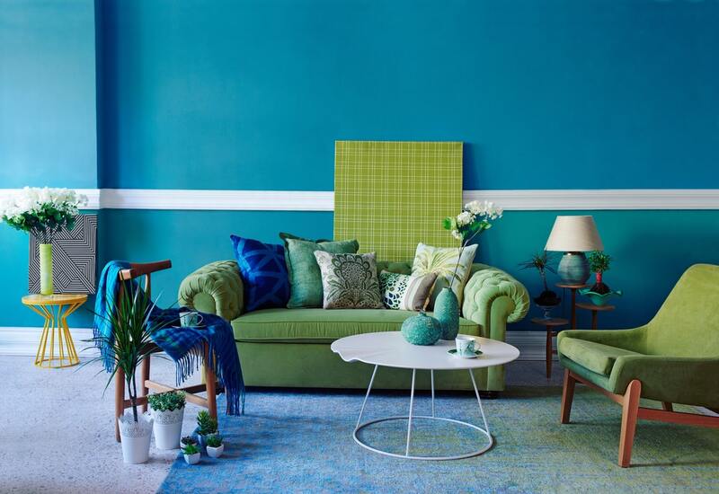
Talking the bold colors, lush greens, deep blues, berry reds, and burnt oranges are in style. These colors give rooms a little drama as well as warmth and comfort. Color blocking, or using two or more contrasting tones, is still a popular way to create eye-catching interiors.
Naturally, the neutral color scheme continues to be inspired by nature. Seafoam, dried grass, cloud, and mushrooms are just a few of the natural colors that will get you through the upcoming year of decorating.
To learn about all the major paint trends, refer to the guide below
- Inky Blues
Deep sea tones come to mind when talking about the blues. Despite the navy's continued popularity, darker blues are evolving into more royal shades. Consider using them in an immersive way by complementing the color of linens and furnishings.
Instead, consider decorating your living room with neutral Inky blue walls, indigo-striped curtains, and cobalt-patterned pillows. Blue color combinations work exceptionally well together and offer a lot of potential for pattern combining.
Blue is a sober color for living rooms and is excellent for giving an often busy space a calm and sophisticated appearance. This color has a fun side despite having a slight trace of violet in its undertone, especially when it has a shiny Satin finish. The color creates a look similar to navy when used on cabinets in a modern setting.
2. Pistachio
Pistachio is making a splash right now with the trend for deep, forest greens fading into delicate sage greens and this gentle tone. With its retro overtones, this green loses coolness and becomes a cheerful and energetic color.
Going green has been more popular in recent years. Although dark green currently has the upper hand, this look will eventually incorporate lighter, more delicate greens like pistachio.
3. Rich Neutrals
Holding a hot chocolate cup or a caramel latte in your hands is the most relaxing and soothing thing you can do. Therefore, it shouldn't be surprising that these colors appear more frequently in the current neutral color scheme.
These lavish neutrals are perfect for designing living rooms. Similar colors are now in trend to style kitchens and bathrooms.
4. Hand Painted Murals
What’s better to create a conspicuous focal point than to make your mural which is sure to get guests talking?
Pastel colors can help brighten a space and fill it with positive energy. To avoid the color scheme looking excessively sweet, choose softer pinks, mustard yellows, and dusky teals instead of more white-based tones.
The appeal of pastels is that they provide an excellent middle ground between dull neutrals and dark paint colors.
5. Mixing Gloss & Matt
Mixing matt and gloss paints in the same color is a brilliant way to add depth and character to a flat wall. Try a checkerboard design with alternating stripes.
Due to the change in the paint finish, the light will reflect off them in different ways, adding interest to a boring wall.
6. Stylish Heights
Interior designers like Abigail Aherne helped popularise the painted ceiling style. This time it will continue around with some splashes of color. Painting your ceilings can change the atmosphere if they feel too high and airy or too low and tight.
Try painting the walls where a picture rail would be if you want to lower the ceiling height. It will blur the lines between the wall and ceiling surfaces. Without any architectural ways, it can also provide interest to the room.
7. Tri-Colour Room
Highlighting stripes or color blocking in a room are excellent methods to add character, color, and design features. Choose contrasting colors in broad stripes and apply them to doors, skirting, and architectural details for a dynamic, fun scheme with a contemporary feel.
To give it a subtle appearance, add a color highlight to architectural elements like skirting. A color combination will have more of an impact on the viewer the more contrasting it is.
Along with rich and traditional “Bronze Red,” spectacular “Deep Space Blue,” and other complementing colors, an accent of earthy “Yellow-Pink” will look fantastic.
8. Reds With Pink Undertones
The typical deep reds will continue to be a popular paint color, this time with rich pink undertones. To create a dramatic appearance that exudes enthusiasm and energy.
Apply these warm colors all over for statement-making rooms or in lesser amounts on a front door, a kitchen, or even stairways.
9. Dusky Pink
Earthy pink colors have caught our attention in recent years. They provide warmth and comfort to our environments. Thus, the trend will last long.
Instead of baby pink or delicate white pink, this earthy shade of pink is more of a mixture of blush and beige. It is a soothing shade of pink.
Light pink is a soothing color with a cozy, nostalgic sense. It's an important color because of how well it works in restrooms, kitchens, living spaces, and bedrooms. It looks stunning with varieties of colors, such as ochre, blue, grey, and green. The color creates a homey feeling.
10. Neutrals To Create Tranquility
This minimal approach creates spaces for relaxation, relaxation, and comfort. These cozy neutrals add coziness and warmth to the room. During the finishing, you can add a splash of organic green and a striking unsaturated black-brown effect.
This color insight desires to wrap you in a soothing sense of comfort. Blend soft shades of green, stone, and cream to give every room a welcoming, well-balanced beauty.
11. Light Purple
If you don't like the idea of dark purple as a house color combination, why not use a lighter shade of purple? Instead of choosing a simple color, choose light shades of purple.
The gloss and sparkle of metallic paint convert to light purple, making it a must-have color for home decor. You can make this the center of attention in the space or add accent pieces to make it more eye-catching.
12. Mustard
Not everyone may choose mustard as their first preference for a color scheme for a home. Like tasty food, mustard is a vibrant color that can be overwhelming. Pair them with a suitable shade.
Make sure to let it stand out as a statement item if you wish to use it as a color for your home's interior. Too many colors might overtake the area and give it a cluttered appearance. Therefore, you can add contrasting furniture and accent items to establish a powerful color scheme for your home.
13. Grey
When choosing a color scheme for a house, grey is one of the colors that people don't like much. We are often put off by its cold colors and gloomy appearance while applying it to our decor. Break these myths now since grey may be just as warm and stylish as other colors.
Depending on the style you're striving for, you can choose warm or cold tones of grey. To enhance the design, you can draw attention to this color with bold, contrasting decor pieces.
14. Crimson
Some colors can add a hint of depth to your room. You can achieve that by using the color scheme of red and white for a house. Count on a crimson accent wall to bring depth to an entirely neutral room.
15. Avocado Green
The shade of green known as avocado green is yellowish and works well with other green hues. Play with gold and brass accessories to create a gem theme and highlight the color even more. If you use this color, ensure to illuminate the area with good lighting.
Summing Up
Enhance your area with colors and paint ideas that truly express your style, from rich reds and calming blues to painting the ceiling.
Feeling and comfort through the use of pattern, color, and accessories are likely to continue to be important aspects of the next decade of design whether it's a cozy and soothing environment or a lively and uplifting setting.
Of course, it's not just about bright, vibrant colors. But one will also witness a revival of neutral colors. You can also go for grounded and warming color palettes inspired by nature.